FitGrid AI Advisor Talent Optimization Heatmaps are Now Live (Oct 2025)


What Are Heatmaps?
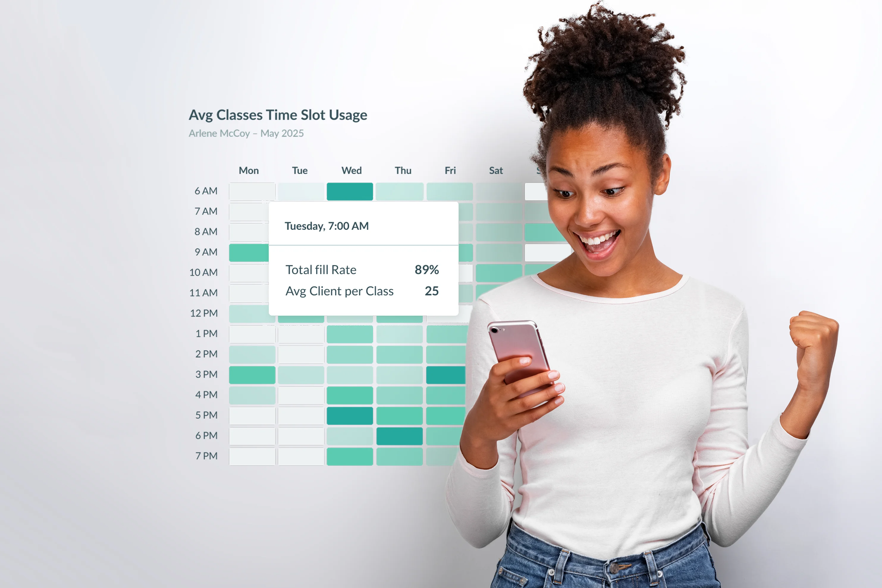
Heatmaps turn your class attendance data into a simple visual map of demand.
Each day of the week runs across the top, each time slot down the side. The darker the color, the higher the attendance. In seconds, you can see when your studio is buzzing—and when it’s quiet.
In FitGrid’s Talent Optimization Dashboard, the Avg Classes Time Slot Usage Heatmap shows exactly that: your strongest and weakest class times based on real client behavior.
.png)
How to Read a Heatmap
Every square on the heatmap represents a single day-and-time slot.
- Dark green = high fill rate (your popular class times)
- Light green or white = lower fill rate (times that may need adjustment)
.png)
Hover over any cell to view details like class time, average clients per class, and fill rate percentage. You can also switch to a List View for a more detailed breakdown by class or instructor.
What to Do with Heatmap Data
Once you’ve spotted the patterns, the next step is action.
- Double down on demand: Add top instructors or classes in peak slots
- Rework underperformers: Move or test new formats in slower hours
- Balance instructor loads: Use data to align schedules fairly
Over time, tracking your heatmap helps you spot seasonal shifts, trending time slots, and instructor performance opportunities—keeping your schedule aligned with how clients actually behave.
Login To Try Heatmaps
No login? Create an account below 👇


